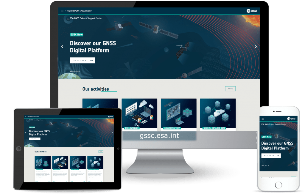
GSSC’s website revamped: Redefining GNSS Science with a Fresh Look and Enhanced User Experience
18/10/2023
1388 views
You may have noticed that the ESA GNSS Science Support Centre (GSSC) website is looking a bit different. That’s because we have made some changes to improve the overall usability of the site and to freshen up the look and feel.
So what are the new features?
- Sleek Redesign: the new portal boasts a striking visual redesign, bringing a contemporary, user-friendly interface more in line with ESA’s corporate identity.
- Enhanced accessibility: we’ve fine-tuned every aspect of your journey within GSSC. Discovering our GNSS data, delving into space science, or exploring cutting-edge applications has never been more seamless.
- A friendlier, more responsive site that is easier to browse using mobile devices.
Visit the GSSC’s website to explore a wealth of GNSS data and resources you need for your work.
Your feedback matters, at GSSC, we believe in a community-driven approach. We encourage all users to explore the redesigned platform and share their thoughts and feedback. Your insights are invaluable as we continue to improve and innovate.
Further improvements will come on stream, so please stay tuned!
Sincerely,
The GSSC Team


